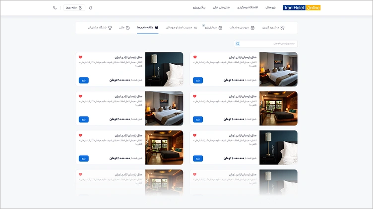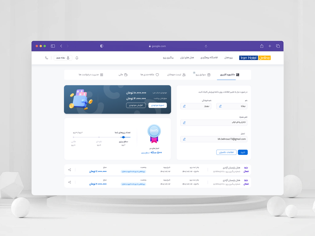
Transforming an outdated reservation dashboard into a scalable self-service portal that empowers travelers to independently manage every stage of their journey.
.
Project Summary
| Subject | Description |
|---|---|
| Company | IranHotel |
| Industry | Online Travel Agency (OTA) |
| Platform | Web & Responsive Mobile |
| Role | Product Designer |
| Team | Product Manager, Developers, Designer, Graphic Designer |
| Responsibilities | UX Research, Information Architecture, UX/UI Design, Interaction Design, Prototyping, Design System, Developer Handoff, Design QA |
.
The Story
Booking a hotel doesn’t end when payment is completed.
The real travel experience begins afterward.
IranHotel already provided a smooth booking experience, but once users completed their reservation, the product offered little support for everything that came next.
A customer dashboard existed, but it had an outdated interface, limited functionality, and a fragmented information structure. Users often struggled to locate reservation details, manage upcoming trips, or access important travel information.
After reviewing customer support tickets, we found that a significant portion of customer requests were simply about locating reservation details after booking.
This highlighted a larger product opportunity.
The challenge wasn’t redesigning a dashboard.
It was redesigning the entire post-booking experience.
.
Understanding the Problem
The existing dashboard created friction throughout the customer journey.
Users struggled to:
- Find reservation details quickly.
- Track the status of their bookings.
- Manage passengers and travel information.
- Access invoices and booking history.
- Continue their journey without contacting customer support.
At the same time, the dashboard itself suffered from several structural issues:
- Outdated visual design
- Weak information architecture
- Limited self-service functionality
- Inconsistent user experience
- Poor responsiveness across devices
The experience no longer met users’ expectations for a modern online travel platform.
.
Discovery
Rather than jumping directly into interface design, I first focused on understanding both user needs and business objectives.
The discovery phase included:
- Workshops with the Product Manager
- Technical discussions with Developers
- Customer support ticket analysis
- Competitive analysis of OTA platforms
These activities helped uncover the biggest pain points after booking and guided the direction of the redesign.
.
Design Goals
The redesign focused on improving the post-booking experience through four primary goals.
Make reservation information easy to access
Users should be able to find reservation details immediately without searching across multiple sections.
Reduce dependency on customer support
Information that previously required contacting support should become available through self-service.
Expand product capabilities
Move beyond a basic reservation dashboard by introducing additional services that support travelers throughout their journey.
Build a scalable experience
Create a flexible foundation that allows future features to be added while maintaining consistency.
.
My Role
As the Product Designer, I owned the end-to-end design process.
My responsibilities included:
- UX Research
- Information Architecture
- User Flow Design
- UX Design
- UI Design
- Interaction Design
- Responsive Design
- Interactive Prototyping
- Design System
- Developer Handoff
- Design QA
I collaborated closely with Product Managers, Developers, Designers, and the Graphic Design team throughout the project.
.
Design Decisions
Every design decision was driven by one question:
How can we help users manage their trips with less effort?
.
Prioritized reservation information
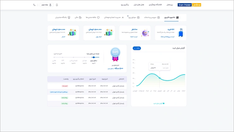
Reservation details became the primary focus of the dashboard, allowing users to immediately understand the status of their bookings.
Improved information architecture
Related features were reorganized into a clearer navigation structure, making important information easier to discover.
Expanded self-service capabilities
The dashboard evolved from a reservation viewer into a complete customer portal.
Users could now independently manage much more of their travel experience without relying on customer support.
Designed for scalability
Reusable components and the existing Design System ensured consistency while making future product expansion easier.
.
Feature Expansion
One of the most valuable outcomes of the redesign was expanding the product beyond reservation management.
The redesigned portal introduced or significantly improved features such as:
- Reservation Dashboard
- Reservation Details
- Reservation Status Tracking
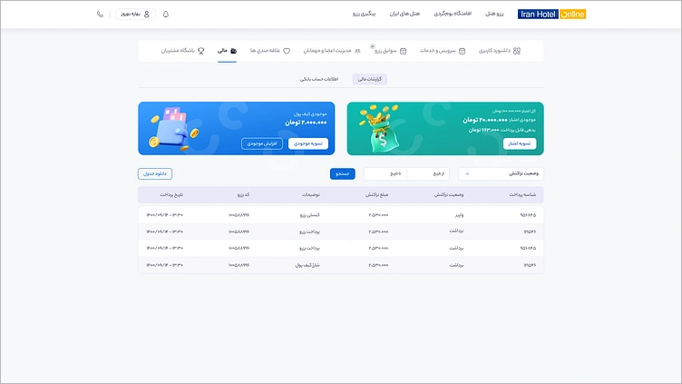
- Wallet
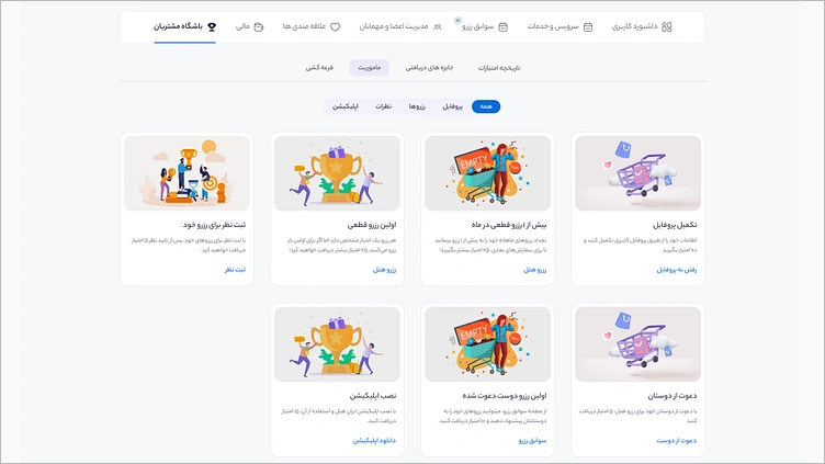
- Loyalty Club
- Reward History
- Passenger Management
- Favorite Hotels
- Favorite Destinations
- Invoice Management
- Notifications
- User Profile
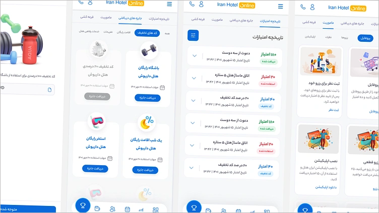
- Responsive Mobile Experience
The dashboard became a centralized destination for managing the entire post-booking journey rather than a simple list of reservations.
.
Responsive Experience
Travelers frequently access booking information while away from their computers.
For that reason, responsiveness was considered from the beginning of the design process rather than treated as a final adaptation.
The mobile experience preserved the same information architecture while optimizing layouts and interactions for smaller screens, ensuring users could manage their reservations across devices without losing functionality.
.
Outcome
The redesign transformed a limited customer dashboard into a more comprehensive self-service experience.
Following the launch:
- Reservation information became easier to find.
- Users gained greater control over managing their trips.
- The product offered a broader range of post-booking services.
- The experience became more consistent across desktop and mobile.
- Customer reliance on support was reduced through improved self-service capabilities.
.
Reflection
This project reinforced an important lesson:
A dashboard isn’t just a collection of screens. It’s a product experience.
Designing this project taught me that solving user problems often requires rethinking the entire journey rather than improving individual interfaces.
If I were redesigning this experience today, I would place greater emphasis on validating Information Architecture through usability testing, leveraging product analytics to prioritize future improvements, and evolving the portal into a more personalized travel management experience.