The Beginning of the Story
Gestion Helicos is an internal platform designed to manage luxury recreational helicopter flights in Monaco. Initially, the product existed only as a web-based admin dashboard, used by internal administrators to manage flights, schedules, passengers, and operational details.
While the dashboard covered core management needs, over time it became clear that the workflow did not fully align with the real, day-to-day operational context of support teams and flight coordinators. Many critical tasks required quick actions, on-the-go access, and real-time updates—something the existing dashboard was not optimized for.
This gap became the starting point for introducing a mobile application alongside the existing admin dashboard.
My Role
As a Product Designer, I was responsible for analyzing operational workflows, conducting user research with internal stakeholders, defining the mobile experience strategy, designing the UX and UI of the application, ensuring consistency between the dashboard and the app, and closely collaborating with the engineering team through implementation.
Discovery & User Research
-
Started with a research-driven approach grounded in real operational contexts to validate the need for a mobile application
-
Conducted interviews with operations managers to understand business goals, constraints, and key performance indicators (KPIs)
-
Held direct conversations with support agents to identify daily pain points and operational challenges
-
Performed contextual and field research by observing how teams managed flights in real-time environments
-
Identified moments where desktop dependency caused operational bottlenecks, delays, and increased error rates
-
Concluded that there was a strong need for fast, mobile-first, and real-time access to flight management tools
Key Insights
Research findings revealed that many operational decisions are made on the move and under time pressure. While the dashboard was well-suited for deep management and configuration, it was not optimized for quick operational actions. A mobile application could significantly reduce cognitive load, speed up decision-making, and better align with real-world workflows. It also became clear that the dashboard and mobile app needed distinct yet complementary roles to create a seamless overall experience.
Product Strategy
Based on these insights, the product strategy focused on extending the existing system rather than replacing it. The dashboard remained the primary tool for complex management, analytics, and configuration, while the mobile app was designed around speed, clarity, and operational efficiency. This clear separation of responsibilities ensured a focused and frictionless user experience across platforms.
Design Infrastructure & Engineering Alignment
The design process was tightly aligned with the technical infrastructure. The engineering team used Tailwind CSS as the core UI framework, which directly influenced design decisions. Components were designed with a utility-first mindset, ensuring a smooth handoff between design and development and enabling faster iteration cycles.
In parallel, the Catalyst Design System was used as the foundational component framework. All components were designed in alignment with Catalyst’s structure and conventions to maintain visual and behavioral consistency between the dashboard and the mobile app. Standardized interaction patterns, states, and feedback mechanisms improved reusability and long-term scalability.
Design Process
-
Defined the core operational flows of the mobile application as the starting point of the design process
-
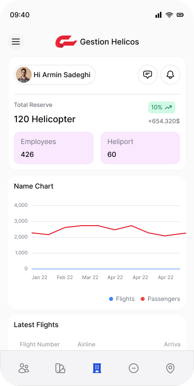
Focused on key use cases such as viewing flight statuses, managing changes quickly, and accessing critical information with minimal friction
-
Designed the experience to be task-oriented and optimized for real-world mobile usage scenarios
-
Prioritized clear information hierarchy, scannability, and visual clarity to support fast and confident decision-making
-
Aligned all UI patterns and components with the Catalyst Design System to ensure consistency across the product ecosystem
Validation & Iteration
Early design concepts were shared with internal stakeholders and support teams to validate assumptions against real operational scenarios. Feedback sessions led to multiple iterations, refining information order, interactions, and visual details until the experience effectively supported real-world usage.
Handoff & Implementation
After finalizing the designs, a complete handoff was delivered to the engineering team. Throughout development, I closely collaborated with developers to ensure accurate implementation of UX details and proper alignment with Tailwind and Catalyst standards.
Impact & Outcomes
The project resulted in improved operational efficiency by reducing response times and enabling faster access to critical flight information. Friction within support workflows was reduced, and the product experience became more aligned with how internal teams actually work. The dashboard and mobile app now function as a cohesive ecosystem with clearly defined roles. Additionally, the strong alignment between the Design System, Catalyst, and Tailwind established a scalable and future-proof foundation for ongoing product development.
Closing
Gestion Helicos evolved from a single administrative dashboard into a multi-platform operational system—one that reflects the realities of managing luxury helicopter flights in Monaco and is built on a modern, scalable, and well-integrated design and development foundation.
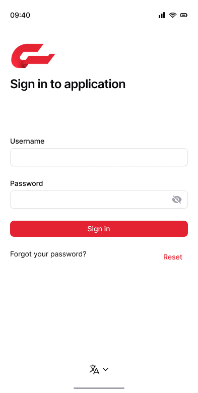
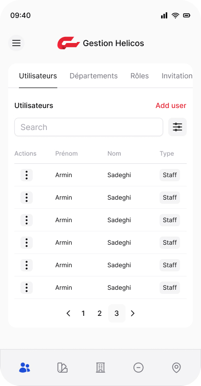
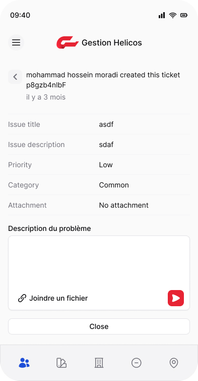
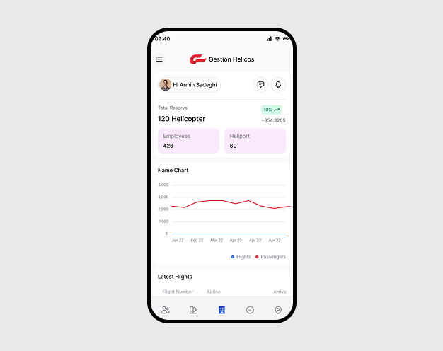
Below, you can explore selected screens and design outputs from this project.