Designing a dedicated landing page for Eghamat24’s Flight service to establish an SEO foundation, increase organic visibility, and create a scalable entry point for future content growth.
.
Overview
As Eghamat24 expanded its travel services, the Flight section lacked a dedicated homepage. Users could access the flight search flow, but there was no SEO-focused landing page capable of attracting organic traffic or supporting long-term content growth.
The primary objective of this project was to design a dedicated Flight Landing Page that would serve as the foundation for the company’s SEO strategy while remaining scalable for future product development.
.
Project Information
| Item | Description |
|---|---|
| Company | Eghamat24 |
| Industry | Online Travel Agency (OTA) |
| Platform | Web |
| Project Type | SEO Landing Page |
| My Role | Product Designer |
| Responsibilities | UX Design, UI Design, Research, Prototype, Developer Handoff |
| Collaborators | Product Manager, Product Owner, SEO Team, Marketing Team, Developers |
| Tools | Figma, ChatGPT, Claude, Gemini, Figma AI |
.
The Challenge
Unlike other services within the platform, the Flight section did not have a dedicated homepage.
Without a dedicated landing page, the product lacked a scalable structure for search engine indexing and content expansion. This limited the SEO team’s ability to improve organic visibility and build landing pages around high-value travel keywords.
The project focused on solving several challenges:
- No dedicated homepage for the Flight service
- No SEO-oriented page structure
- No scalable content architecture
- Limited opportunity to attract organic traffic
- No flexible layout for future SEO content
.
Business Goal
The objective was straightforward:
- Create a dedicated homepage for the Flight service
- Build a scalable SEO foundation
- Support future content expansion
- Improve the discoverability of the Flight service through search engines
.
Research & Discovery
To better understand the business requirements, I collaborated with the Product, Marketing, and SEO teams.
We reviewed existing SEO goals and analyzed how competing travel platforms structured their flight landing pages.
The research focused on:
- Landing page structure
- Information Architecture
- Content hierarchy
- Internal linking opportunities
- Placement of the search experience
- Expandability for future content
.
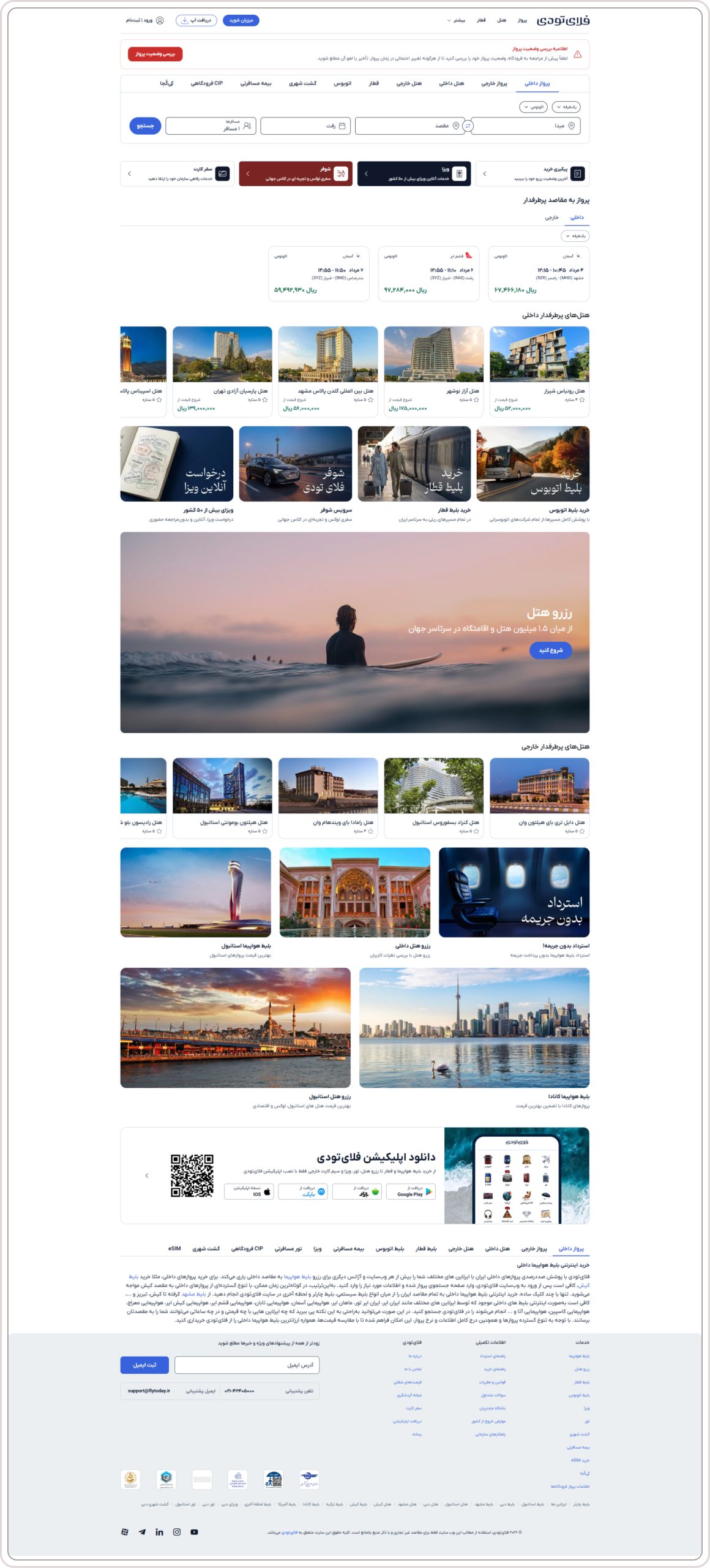
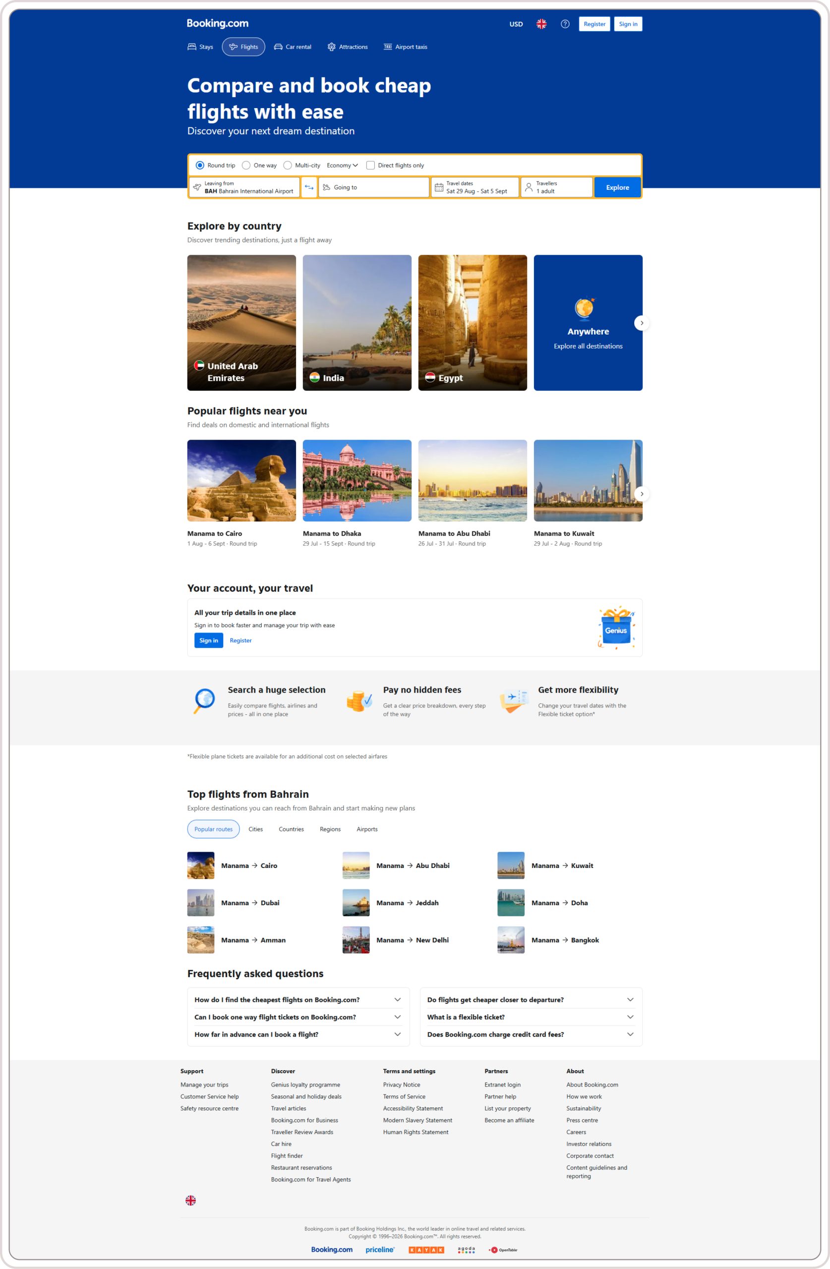
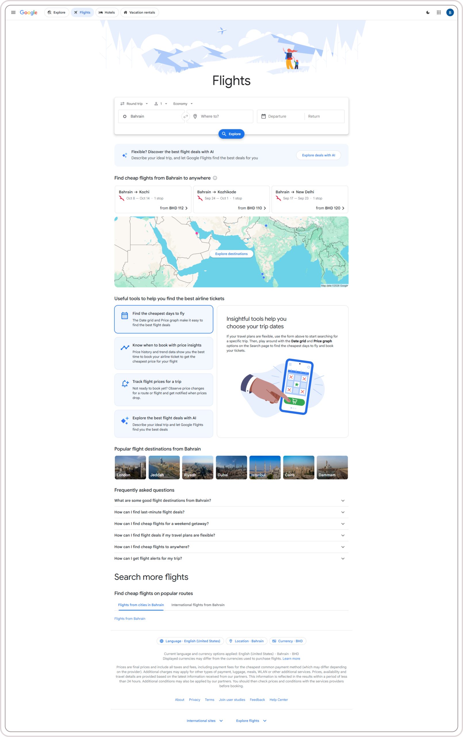
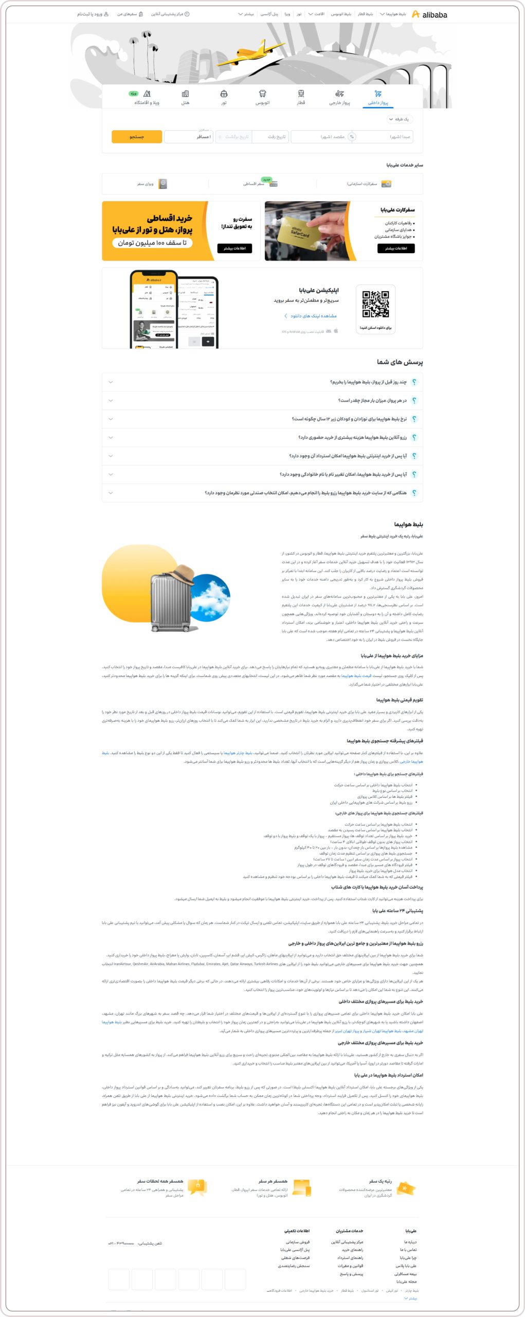
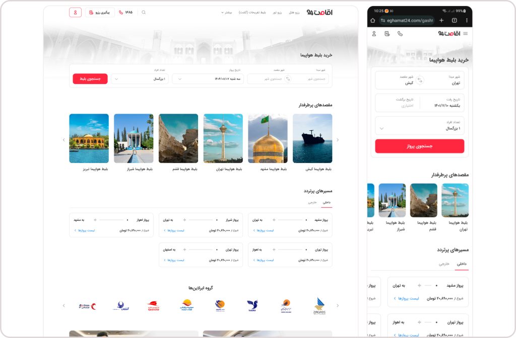
Competitive Benchmark.
.
Final Solution
The redesigned homepage included several reusable content sections designed around SEO principles.
The page consisted of:
- Flight Search Section
- Popular Destinations
- Promotional Sections
- Internal Navigation Links
- Category Blocks
- SEO Content Areas
- Expandable Content Modules
The modular approach enables future content growth while keeping the page organized and maintainable.
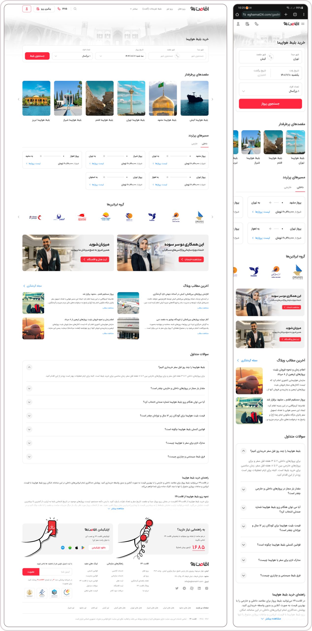
Final Homepage
.
Developer Handoff
After finalizing the designs, interactive prototypes and implementation specifications were delivered to the development team.
Throughout implementation, I collaborated closely with developers to ensure design quality and consistency with the approved layouts.
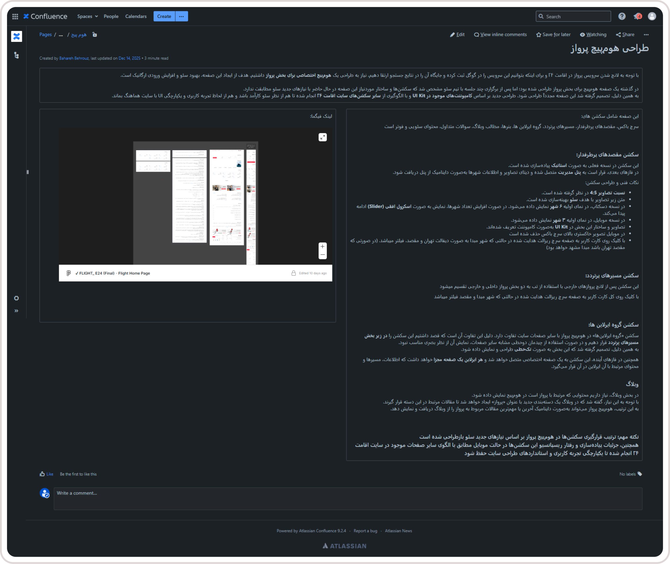
Developer Handoff
.
Results
The project was successfully launched and became the official homepage for the Flight service.
The outcome included:
- A dedicated homepage for the Flight product
- A scalable SEO-focused page architecture
- A flexible structure for future content expansion
- Alignment between Product, SEO, and Marketing teams
- Positive stakeholder feedback after delivery
.
AI-Assisted Workflow
AI tools were used throughout the design process to accelerate research, documentation, and design exploration.
Claude (Anthropic)
Used for reviewing page structure, evaluating user flows, suggesting improvements for landing page organization, and refining UX documentation.
ChatGPT (OpenAI)
Used for research, documentation, content refinement, competitive analysis, and organizing design decisions.
Gemini
Used to gather additional references and compare different approaches to SEO landing pages.
Figma AI
Used during ideation to explore alternative layouts and generate early concepts for different homepage sections.
AI supported research and exploration, while all product decisions, UX strategy, and final design execution remained human-led.
.
Key Takeaways
This project demonstrated that an effective SEO landing page is more than a marketing asset—it is part of the product experience.
Designing the page required balancing SEO requirements, business goals, information architecture, and scalability to create a foundation that could evolve alongside the product.
The result was not simply a new homepage, but a reusable framework for future growth of the Flight service within Eghamat24.