The Context
Heli Air Monaco is a helicopter booking service operating in Monaco.
The existing mobile application no longer met user expectations. The booking journey contained unnecessary steps, the interface felt outdated, and the overall experience did not reflect the premium nature of the service.
The project was initiated by the Product Manager with the objective of redesigning the application and creating a faster, more intuitive booking experience while increasing booking conversion.
.
Where the Journey Broke
Instead of analyzing isolated screens, I looked at the booking journey as one continuous experience.
The existing flow required users to move through multiple screens before reaching confirmation, creating unnecessary friction throughout the process.
Three main issues became apparent:
- Too many interactions before completing a reservation.
- An outdated interface that didn’t communicate a premium brand.
- Information presented at the wrong moments, making decision-making more difficult.
📷 Booking Journey Diagram
.
Learning From the Market
Since the project focused on redesigning an existing product, I first analyzed how similar premium services approached helicopter reservations.
The primary benchmark was Blade, where I studied:
- Overall booking flow
- Navigation patterns
- Information hierarchy
- Flight selection
- Booking confirmation
- Premium visual language
Rather than copying individual screens, the goal was to understand how successful products reduce friction while maintaining clarity.
📷 Competitor Benchmark
.
Designing a Better Journey
The redesign wasn’t about making the interface look more modern—it was about reducing cognitive effort throughout the booking experience.
The biggest design decision was rebuilding the booking flow.
Every screen was evaluated with one simple question:
“Does this help users complete their reservation faster?”
If the answer was no, the interaction was simplified, reorganized or removed.
At the same time, the information architecture was redesigned so users only saw the information they needed at each step, reducing visual overload.
To ensure consistency across the product, I also created a dedicated Design System with reusable components that could support future development.
📷 User Flow
📷 Design System
.
Visual Direction
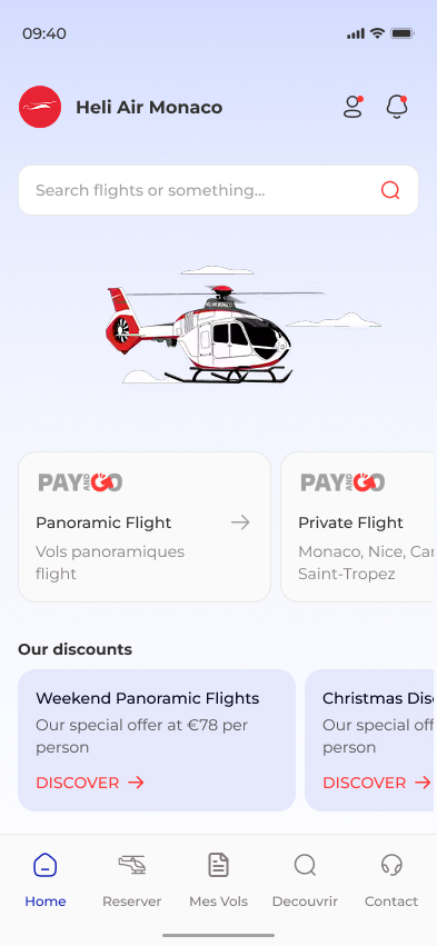
Because Heli Air Monaco is positioned as a premium travel service, visual design played an important role in building trust.
The interface was intentionally kept clean, spacious and minimal, allowing flight information to remain the primary focus while reinforcing the luxury identity of the brand.
Typography, spacing, color usage and component behavior were all designed to create a calm and effortless booking experience.
📷 UI Showcase
.
From Design to Development
After finalizing the designs, the project was handed over through organized Figma files, design documentation and Dev Mode.
Close collaboration with developers throughout implementation helped ensure the final product accurately reflected the intended experience.
📷 Developer Handoff
.
Outcome
The redesigned application was approved by both the client and the product team.
The MVP entered development and was successfully released, providing the team with a scalable foundation for future iterations.
The project also introduced a reusable Design System that simplified future product expansion and