Introduction
An effective dashboard offers a clear and intuitive user experience by presenting essential information in a straightforward manner. Iranserver’s redesigned user panel exemplifies this approach.
.
My Role
As a product designer for the dashboard redesign, my responsibilities included:
- Conducting user research
- Creating wireframes & prototypes
- Collaborating with development
- Conducting post-launch reviews
.
Context & Problem Statement
The previous Iranserver user panel faced significant challenges in terms of user experience.
- The complex interface, particularly for novice users, led to confusion and reduced satisfaction.
- slow page load times, especially during peak hours, had a significant impact on user efficiency and increased bounce rates.
- Surveys indicated that many users sought a simpler way to manage their services and were dissatisfied with the lack of a user-friendly dashboard that provided quick access to their purchased services.
- Heatmap analysis showed that the news and announcements section and FAQ, which was a prominent part of the previous dashboard, did not attract much user attention and actually cluttered the dashboard.
.
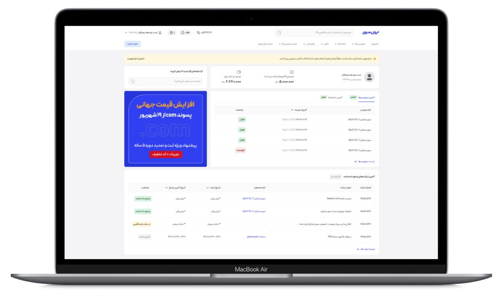
You can see an example of an old dashboard in the image below.

.
Competitor features analysis
By analyzing competitors like Abraravan, Parspak, and Vultr, I identified key features and gaps in their offerings. This analysis helps me improve my own product to better serve our target audience:
- A list of purchased products with a button to direct the user to the product management page
- A display of the user’s latest tickets along with their response status
- A banner for advertisements and campaigns
- Sections related to invoices and recent payments
- A prominent display of a key product feature for stakeholders
- User profile display
- Notifications display
.
Information Architecture
We redesigned the system’s information architecture and navigation, considering user needs and expectations. By aligning new categories with user mental models, we’ve improved system usability and helped users achieve their goals more easily.

.
Solutions
To address the identified challenges, the following solutions were implemented:
- Redesigned User Interface: The user interface was completely redesigned using modern design principles and materials to create a simpler, more intuitive, and device-compatible interface.
- Reduced Clicks: By improving information architecture and menu structure, the number of clicks required to access services was minimized.
- Simplified Language: Complex technical terms were avoided, and simple, easy-to-understand language was used to explain features and functionalities.
- Clear Display of Important Information: Essential information such as service status and notifications was prominently displayed on the dashboard.
- Easy Access to Services: Users can easily access their purchased services directly from the homepage and manage them efficiently.
By implementing these solutions, we addressed the previous user panel’s issues, resulting in a smoother user experience.
.
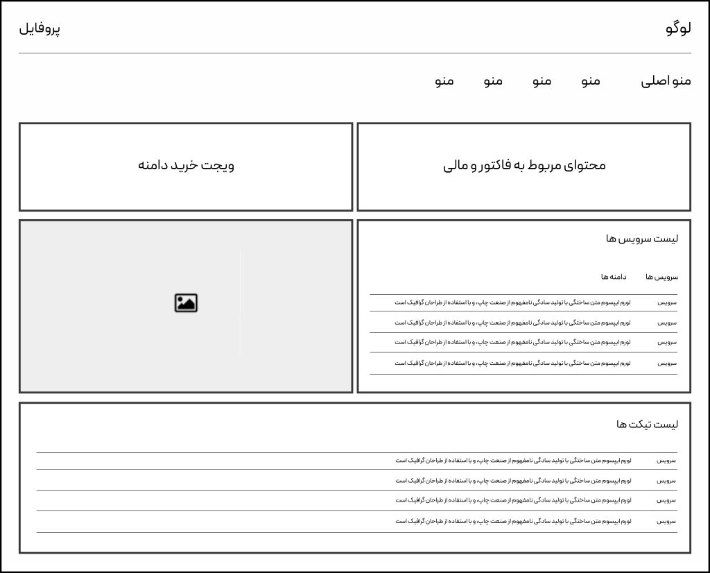
Ideation and Sketching Phase
low-fidelity wireframes
Starting with a rough sketch has become an integral part of my design process. I am always trying to go with a rough sketch before the final UI.
I followed a design process that began with low-fidelity wireframes, which were then iterated on and refined into high-fidelity prototypes using Figma.
To validate design decisions, I started by creating high-fidelity mockups before moving on to final visuals. Additionally, I generated a Prototype to effectively communicate design ideas with the development team.
.
Outcomes
Our dashboard redesign prioritized user experience and engagement. By analyzing user behavior and support feedback, we achieved significant improvements.
Improved user experience: Our dashboard redesign has significantly boosted user satisfaction through a more intuitive interface, streamlined navigation, and enhanced performance.
Reduced support costs: The simplified dashboard has decreased the number of support inquiries, resulting in significant cost savings.
Enhanced user productivity: We’ve improved menu navigation and information architecture, making it easier for users to find what they need, such as renewal options.
Strengthened brand image: Our modern and efficient dashboard has elevated our brand perception, fostering trust and reliability.
.
.
Future Plans
The dashboard redesign has significantly improved user experience and increased user engagement. These results demonstrate that investing in design and user experience can lead to increased sales and a stronger brand image.
For future improvements, I recommend focusing on further personalizing the user experience and increasing page load speeds.


